Color Psychology and Marketing: Does Color Really Affect Our Perceptions?
Can color really influence consumer perceptions? We're going to dispell the biggest myths on the topic - and whether or not color psychology should factor into your marketing strategy.
By Beth Owens — 12 January, 2020
Last month, the Pantone Colour Institute revealed the Pantone color of the year for 2020: ‘Classic Blue’. According to Pantone, the shade is characterized as “Instilling calm, confidence, and connection, this enduring blue hue highlights our desire for a dependable and stable foundation on which to build as we cross the threshold into a new era.”

That seems like an awful lot to pull from a color, wouldn’t you agree? Yet Pantone’s yearly announcement is eagerly awaited by graphic designers and marketers alike. It’s an expression of the huge influence that color psychology on the world of branding and advertising.

What is Colour Psychology?
Put simply, the definition of color psychology is the study of how color affects human perception and behavior. Humans as a species are very reliant on sight, so visual information such as light, color and shadow are very important to how we perceive the world - as well as our influencing emotions and mood.
Although it sometimes feels like a marketing gimmick, the psychology of color is not a recent body of thought. Ancient civilizations such as the Egyptians, Greeks, and Romans all studied the effect that different colors have on behavior. Karl Jung, the famed psychologist, was particularly interested in its possible use in psychotherapy treatments.
However, it was indeed the world of marketing and branding that made color psychology mainstream. Perhaps not surprisingly, the idea that color can influence how consumers feel about a brand has served as catnip to advertisers for decades.

The color wheel is commonly used in color psychology and marketing to visually explore the impact of color on our psyche:
Blue color psychology
Emotional associations: Peaceful, relaxing, sincere
Blue is a calming hue, making it a very popular color in branding across many industries because it feels solid and reliable. However, it can come across as cold and remote depending on the shade you choose to use.
Green color psychology
Emotional associations: Sustainability, fertility, health
With its connection to nature and the environment, green is a nurturing color that is seen to provide a psychological escape. As a result, it offers a lot of positive symbolism for businesses to draw from.
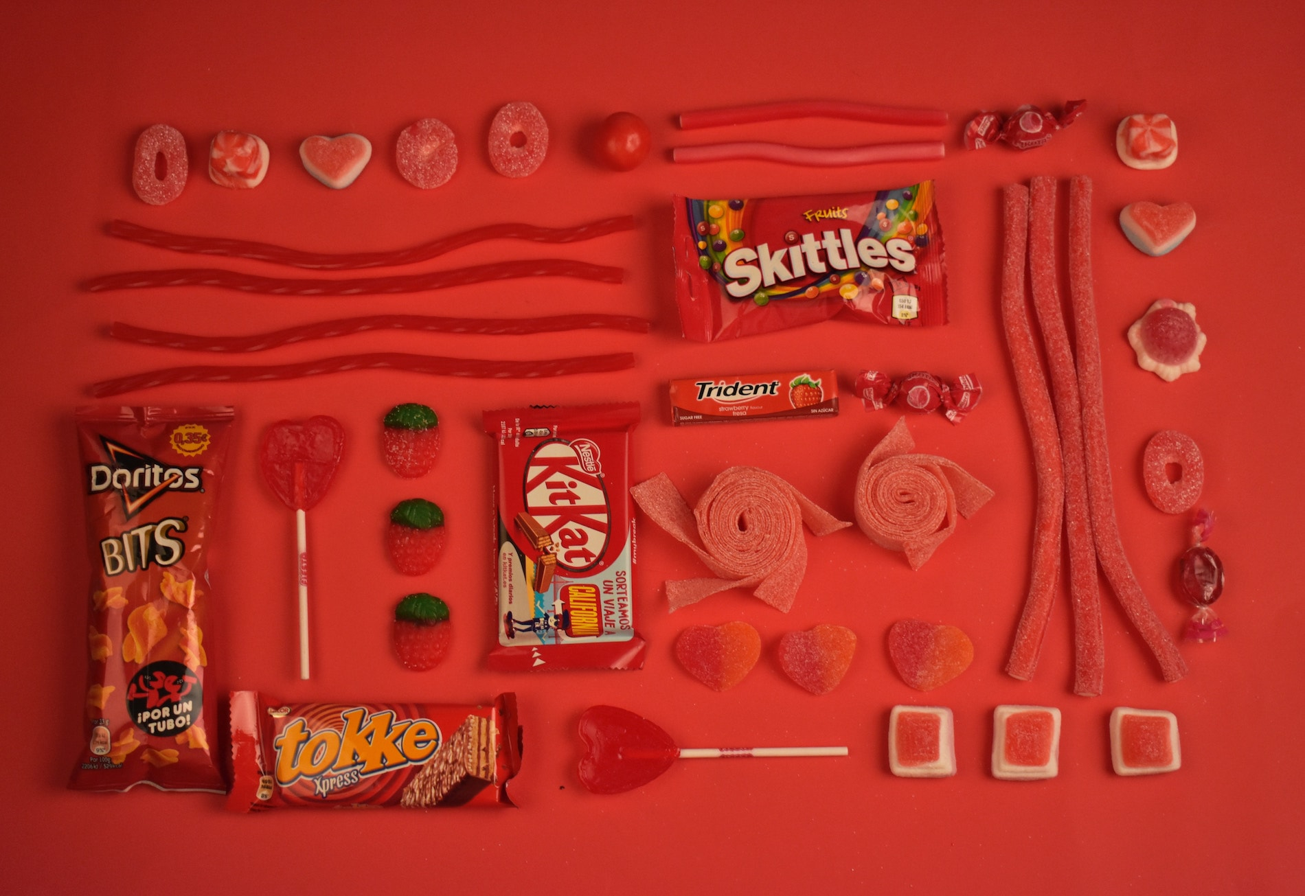
Red Color Psychology
Emotional associations: Power, passion, energy
Red is easily one of the most attention-grabbing colors, hence why it’s often used on sales signage. However, it’s in-your-face nature can make it quite polarising in branding. Using a lot of red can come across as aggressive, which may not be in the interests of your brand.
Orange color psychology
Emotional associations: enthusiasm, excitement, energy
Orange is a divisive color because it’s quite an assault on the senses. People tend to either love it or hate it, meaning that it needs to be used carefully by businesses. Either way, it’s sure to garner an emotional response!
Yellow color psychology
Emotional associations: Warmth, happiness, optimism
Yellow has a lot of positive emotional associations, but needs to be used sparingly, or alongside another hue, because it can create a lot of visual fatigue for consumers.
Purple color psychology
Emotional associations: Power, wealth, sensuality
Because of its regal associations, purple is used by brands to try and channel a more luxury or hedonistic feel in their products (Cadbury’s chocolate is one example). Because it isn’t a common color in nature, it also has mysterious or uncanny undertones.
White color psychology
Emotional associations: Purity, cleanliness, peace
Minimalism is trending in branding at the moment because it feels clean and aesthetically pleasing, symbolizing a blank slate for the consumer to build on, but it can also come across as plain and sterile depending on how it is executed.
Black color psychology
Emotional associations: Formality, boldness, strength
Black is viewed as a timeless and versitile color, which is why it's so widely used across industries from fashion to electronics. It can also come across as oppressive when used in isolation, so using an accent color alongside can avoid this.

Color Psychology Theory
So, how does color psychology actually work? To understand this, we need to dive into a bit of neuroscience.
Humans receive a lot of visual information every second, much more than we can consciously be aware of. In fact, our brain is much better with images than it is with text. Around 90% of the information that our brain receives is visual, with roughly 30% of our brain dedicated exclusively to interpreting it. Now that is a lot of brainpower!
Without getting too technical, all of this visual information needs to be converted into electrical signals that our brain can understand, and humans have evolved so that this happens almost instantaneously. If there was some kind of predator up ahead, for example, precious seconds can make all the difference to whether we can escape quickly enough.
The hypothalamus is an area of the brain which controls hormones and emotional responses, such as whether we feel alert, calm or hungry. It’s already been proven that certain forms of light have a psychological impact: blue/green light blocks the release of melatonin, also known as the ‘sleep hormone’, which is why it’s recommended that we don’t spend time on electronic devices right before bed.
In theory, this means that we can influence the kind of response that a person will have towards a physical space or an object, depending on the color spectrum used.
So, does using color psychology in marketing actually work, or is it massively overhyped in its effectiveness?

Color Psychology in Marketing
It goes without saying that color mythology isn’t a complete myth. But this isn’t the same as saying that marketers can control consumer perception down to the tee; it’s a far more nuanced phenomenon in practice.
We all know that when it comes to branding and marketing, color theory really does matter. Brands can spend months deciding on exact shades and color combinations for their color palette, and with good reason.
Your color choice can make you unique and noticeable, or if you aren’t careful, a copycat within your industry. For example, it’s very difficult to imagine another tech company choosing all-white packaging (Apple cornered brand recall with this design decades ago). Some of the world’s most successful brands have even trademarked their signature hues - ‘Tiffany blue’ is a case in point. But does color really influence how consumers think about brands?

Multiple studies have shown that color really does have a measurable effect on consumer perceptions - but not necessarily in the way we might think.
It’s been proven that up to 90% of our first impressions about products are based on the color of their packaging. This isn’t surprising, considering that color is one of the primary sources of information that our brains first pick up on. Studies also show that some colors can be associated with certain impressions. Blue is the most likely shade to represent competence and calm, while red is associated with excitement (and even faster heart rates!).
But there is evidence that it’s the presence of color itself which creates the biggest response, rather than the specifics of what color is present.
A study from 2013 suggests that color plays a big role in the perceived ‘attractiveness’ of product packaging. The research found that brightly-colored packaging designs inspired more impulse-buying behaviors in study participants than plain packaging did. This is because the more visual information the brain receives, the more likely an object is to stimulate the reward-seeking areas of the brain and be a 'call to action'.
It’s also important to consider that as consumers, we have been heavily socialized to link certain color schemes with specific impressions or ideas, rather than these being innate feelings created by our brain.
Green, as an example, has become commonplace in branding for eco-friendly products. This repeated association over time has created the perception of a specific brand personality i.e. nurturing and protecting the planet.
In sum, it’s very difficult to prove that certain colors are hard-wired to produce certain feelings. It’s far more likely that these ideas have been reinforced through socialization and past experiences.

Color Psychology Debunked
Research hasn’t stopped bold claims being made about how color affects us, from endless ‘What color are you?’ quizzes to outright conspiracies. However, there are a few major factors which prevent us from being at the mercy of marketing executives:
We Don’t All Perceive Color the Same Way
The biggest weakness of using color psychology in marketing strategies is that it doesn’t see consumers as individuals. There’s cost, convenience, and past experiences to consider when it comes to our perceptions of a brand.
Personal preference also hugely dictates how we respond to stimuli such as color. Life experience is what shapes how we perceive the world, and even the best branding strategy cannot completely account for this. There’s a much higher likelihood of us gravitating towards a certain product or brand because it uses a color that we like, rather than what a brand may be trying to say through color symbolism.
Moreover, putting too much belief in color psychology contradicts a key branding principle: having brand collateral which is distinctive. Blue might be the most preferred color (almost one-third of people in the US rate it as their favorite color) but it's highly unlikely to make you stand out as a business. From a branding perspective, blue is safe, boring and corporate, and so unlikely to benefit your marketing strategy.
Color isn’t Universal
Those nifty color charts put everything into neat little boxes, which is very palatable for readers but always not rooted in reality. Why? Because the bulk of color psychology research is completed by Western universities that use western subjects. As a result, the conclusions they draw are very Western-centric.
This is a problem, because we can’t assume that these ideas transfer seamlessly between regions - this doesn’t take into account how cultural nuances influence perceptions.
The color red is widely associated with passion and desire in the West. In China, however, red is predominantly associated with luck and prosperity. If you are targeting an international market, these differences are really important to be aware of.
Color Associations Aren’t Static
Just because currently we associate a color with a certain idea, it doesn’t mean that these meanings are set in stone. For example, the ‘pink for girls and blue for boys’ mantra is well-engrained in western culture, but it wasn’t always this way.
Did you know that pink used to be considered a masculine color? Yes, it’s true! This is because pink it's derived from red, which traditionally represents virility.
In 2011, the famous London toy store Hamleys changed the colors of their ‘Boys’ and ‘Girls’ in-store signage due to pressure from customers, who felt that using traditional blue and pink put gendered expectations on children.
As this example shows, it’s very important for brands to stay up-to-date with changing social norms. Because culture is constantly evolving, brands are at risk of appearing behind the curve if they take color psychology as gospel.
The Verdict
So, is it worth using color psychology in marketing strategies going forward? Well, the evidence isn’t clean-cut. While color certainly plays a strong role in brand perception, there isn’t a wealth of evidence to support the effect of specific colors on behavior.
It's clear that trying to play off stereotyped color symbolism is unlikely to be to your brand’s advantage. Color associations change with time, and you never want your brand to look outdated.
What matters more are the norms within your own industry - this means researching color schemes and choosing something which makes your brand distinctive from competitors. This is key to developing a brand identity that works for you long-term.