Creatives: Amy Design Co. x Maison Frida
"My brand vision is adventurous, playful, and authentic. These principles help guide my design and also influence my client work," Amy Young
By noissue — 02 September, 2020

A designer with a heart for pattern, color, and creativity, Amy Young - the founder and designer behind Amy Design Co., will have you head over heels with her fun, bold designs.
This creative visionary enjoys storytelling through her visuals, designing spaces and even collaborating with other designers for a project. And when she's not busy sharing her creativity, just like you, she enjoys chatting with people over a cold beverage.
Get to know more about Amy Young as we chat to her about her creative collaboration with Chicago-based kidswear brand Maison Frida.
Creative: Amy Design Co.
Tell us a bit about yourself/your team.
Hello! I'm Amy Young, the founder of Amy Design Co. based in San Francisco, CA. I work with small businesses to drive their creative vision, finding a way to convey the essence of their brand narrative throughout all platforms, from identity and digital outlets to packaging and print materials. I also design for environments, creating custom painted graphics, wallpaper, and signage for spaces. In my free time I love exploring combinations of simple lines, colors, and shapes - often developing those creations into letterpress cards or prints.

How and why did your brand start?
After working as a designer for over 10 years in marketing agencies, non-profits, digital studios, and architecture and interior design firms, I learned how much I valued project variety and flexibility in design. My previous experience allowed me to work for some major brands, however I was missing that connection to the client and the creative freedom to get a bit more wild with the design, thus inspiring me to start my own studio.

What is your brand vision and why is this important to you?
My brand vision is adventurous, playful, and authentic. These principles help guide my design and also influence my client work.
What’s your design process like and where do you usually get inspiration?
I like to start by interviewing the client, asking them questions about their passion, their vision, their goals, and the mood and emotions they want to express with their business. Based on the response, I create a brand vision that acts as the "north star," focusing all other brand elements around those core values.
I love sourcing inspiration from textiles, fabric, architecture, and tiles - especially while traveling. I'm also inspired by vintage signage and packaging, patterns in nature, and the colors and shapes of the architecture of San Francisco.

What does visual storytelling mean to you?
Visual storytelling means digging deeper, finding the core purpose and vision behind a brand and bringing that to life. It means pushing beyond the confines of a logo and looking at the big picture, incorporating photography, messaging, packaging, brand partnerships, social media design, and making sure those all relate to the brand's values.
What qualities do you look for in a client/collaborator?
Openness to trying new things, trust, playfulness, and understanding.
Tell us a bit about your collaboration with Maison Frida.
Maison Frida started as its own line of children's clothing based in Chicago, IL. Soizic, the founder, was looking to expand the business to offer other children's clothing brands and wanted to have a fresh new identity to reflect the company's new direction. Maison Frida now curates a playful, simple, and colorful collection of designs from makers around the world.

How did you and Maison Frida begin to work together?
Maison Frida was a fan of another project I had worked on for Proclaim, a line of inclusive, earth-friendly lingerie, and reached out to me to see if I could help with their re-brand. I was inspired by Maison Frida's vision to bring together playful brands from around the world, so I was excited to take on the project.

What inspires your designs for this collaboration?
Maison Frida had a strong vision coming into the project, looking for a design that was fun, energetic, and bright. They were very open to trying out more wild options and playing with shape and color which made working together a lot of fun.

What was something that stands out about this collaboration for you?
In the design world, it's common to present clients with "mild," "medium," and "hot" options, testing their limits and often assuming they will pick the mild or medium route. For this project, Soizic was open to the "hot," or more artistic option, which is always the dream for us designers. We both thought the logo reminded us of paintings by Henri Matisse, who we discovered we both love. I really appreciated Maison Frida's willingness to take a risk with the design.

Why did you choose noissue for packaging and what products did you choose from our range?
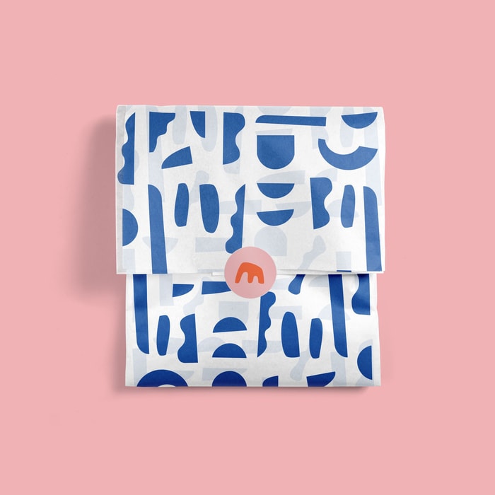
Maison Frida knew they wanted environmentally friendly from the start, so noissue was an easy choice based on the eco-friendly options, color offerings, and flexibility on print run size. We went with the compostable bag, tissue paper, and sticker and love how it turned out!
Find more of Amy Design Co. & Maison Frida here: