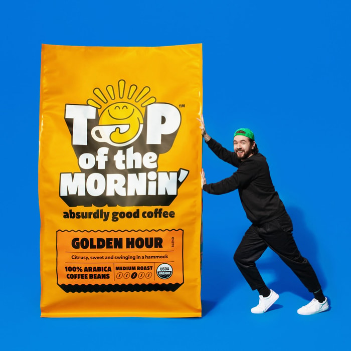
Typography is a silent storyteller in food and beverage packaging design, setting the tone and communicating the brand at a glance. From clean sans-serif typefaces that evoke clean minimalism and sustainability to playful scripts that suggest indulgence, the fonts on packaging shape consumer perceptions. By leveraging typographic narratives, brands craft experiences that resonate deeply with their audience, blending flavor, mood, and trust—all before the product is even tasted.
Packaging as the “Always-On” Marketing Tool
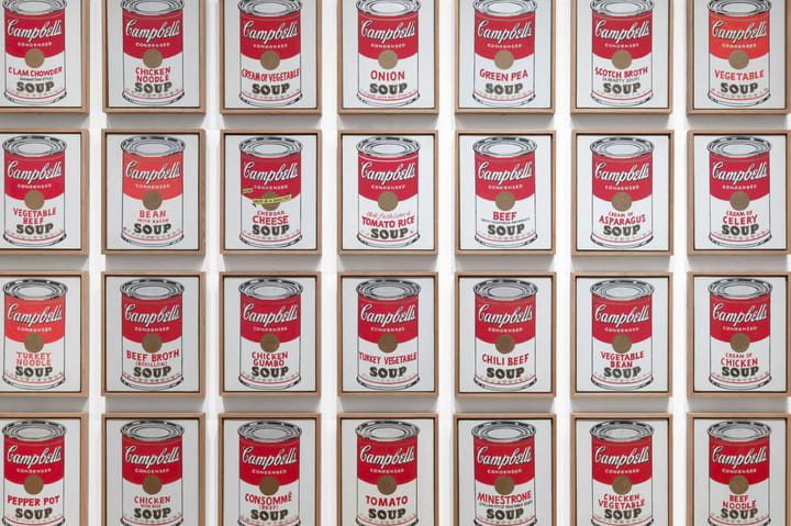
In today’s digital-first world, packaging design has become a brand’s “always-on” marketing tool. With unboxing videos, social media posts, and user-generated content, packaging is constantly on display. Typography plays a starring role here, creating a distinctive brand presence that’s instantly recognizable in photos or videos.

Fonts need to be legible and impactful not only in physical spaces but also on screens. A clean, scalable typeface ensures that a brand’s name or tagline stands out, whether on a store shelf or in a quick scroll on Instagram. This dual role of typography—physical and digital—is critical in maintaining consistent brand visibility.
Modern Trends: Typography Meets Sustainability
In an era of eco-consciousness, using sustainable materials and innovative print techniques has brought typography into sharper focus. On packaging made from recycled materials or compostable substrates, bold fonts in soy-based inks often take center stage, emphasizing the brand’s commitment to the environment. Minimalist typefaces paired with soft, natural tones convey simplicity and transparency—qualities increasingly sought by today’s discerning consumers.
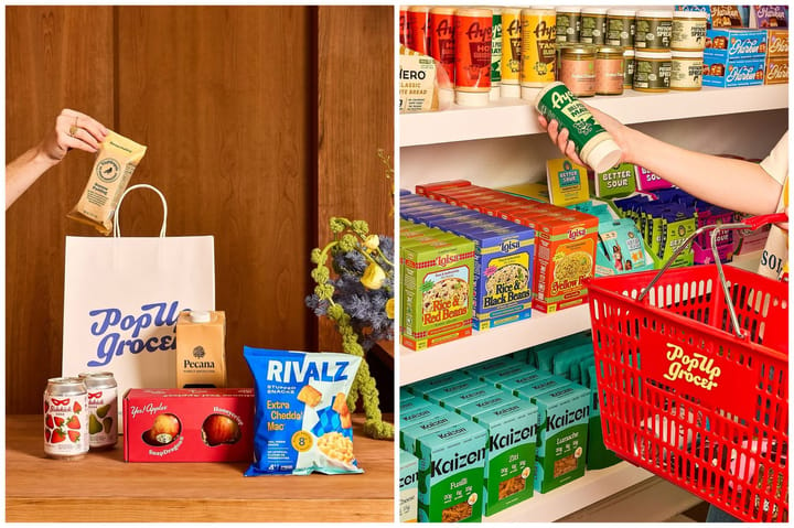
Brands are also experimenting with tactile elements like embossing or letterpress, elevating the sensory appeal of packaging while staying eco-friendly. These subtle design choices enhance typography’s ability to create a lasting impression, proving that sustainable design doesn’t compromise aesthetic impact.
The Role of Typography in Food Narratives
Typography does more than label a product—it tells a story. Fonts can evoke the essence of flavors and textures: a rich, hand-drawn script might hint at the decadence of a chocolate bar, while sharp, geometric letters can convey the crispness of a sparkling beverage. Without a single word, typefaces can communicate heritage, quality, or playfulness, shaping how consumers feel about the product in their hands.

Take the rise of retro-inspired designs that pay homage to 1950s and 1960s American packaging. Fonts from this era, often characterized by bold serifs, whimsical scripts, and cheerful colors, are making a comeback. They carry a sense of nostalgia and trust, resonating with consumers seeking comfort and authenticity in uncertain times. These typefaces aren’t just decorative—they connect a product to a larger cultural narrative, giving it a sense of place and history.
The Color-Typography Dynamic

Color plays a crucial role in shaping how consumers perceive products, particularly in design contexts like coffee cups and packaging. Studies show that the color of a coffee cup can alter taste perception; for instance, black cups make coffee seem fuller bodied compared to white cups, as seen in a 2020 study by the Specialty Coffee Association (SCA) Multisensory Perception of Flavor. This effect, known as crossmodal correspondence, means colors evoke specific sensory expectations before tasting.

Color isn’t just decoration—it’s a silent influencer that shapes how we expect products to taste, even before we try them. A splash of pink on packaging can cue the brain to anticipate sweetness and fruity, berry-like flavors, while earthy browns often signal bitterness or deep, roasted notes. These color cues don’t just hint at flavor—they can actually alter how we perceive it.

This powerful effect can drive a staggering 62–90% of purchasing decisions. Younger consumers tend to gravitate towards bold, vibrant colors like pink, associating them with fun, fruity profiles. Meanwhile, older shoppers often lean toward more traditional tones like brown, which suggest heritage and richness. This highlights how smart color choices can be used to target specific demographics and influence buying behavior.
Global Influence: A World of Typography
Food and beverage packaging has also become a canvas for global typefaces, reflecting the diversity of today’s marketplace. CPG (consumer packaged goods) brands catering to international audiences often incorporate multicultural elements into their typography, blending traditional fonts with modern design trends.

For example, an artisan tea brand might use elegant brushstroke-inspired fonts reminiscent of East Asian calligraphy, while a Latin American snack line could feature vibrant, hand-painted typography evoking local markets. This fusion of styles helps brands appeal to a broader audience, making their products stand out on global shelves while celebrating cultural roots.
Trust and Connection Through Design
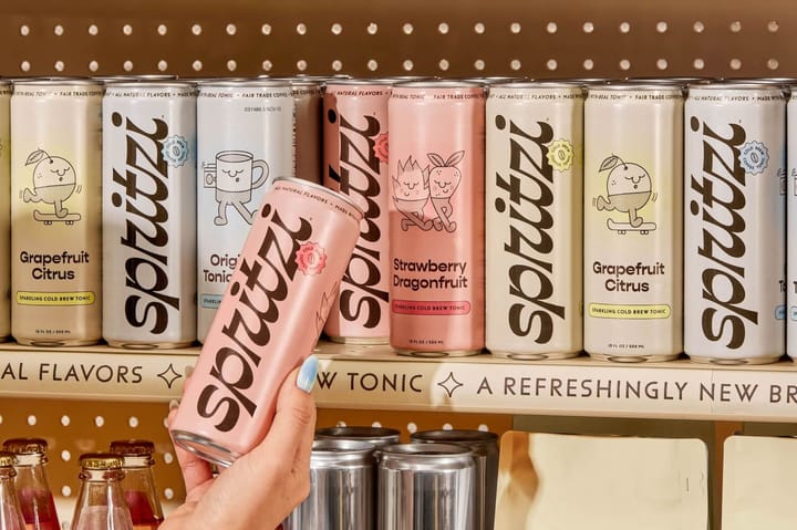
Beyond aesthetics, typography plays a crucial role in building trust. Serif fonts, long associated with tradition and reliability, are often used by heritage brands, while sans-serif fonts communicate modernity and cleanliness. When used sparingly, script fonts can add a personal, artisanal touch, making the product feel handcrafted.
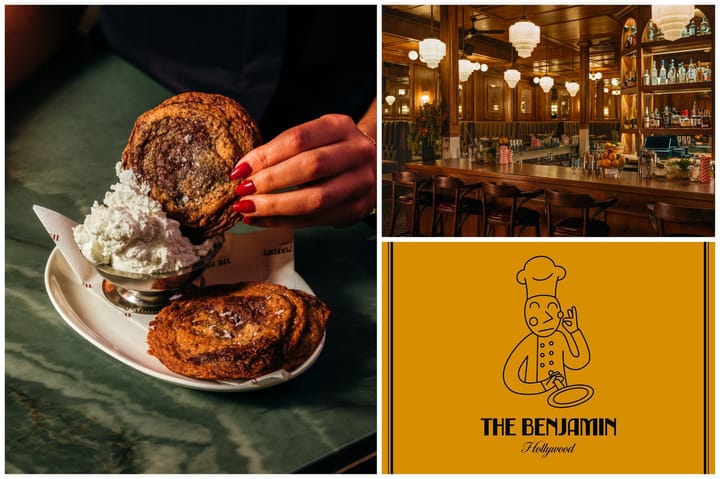
These subtle cues are particularly vital in the crowded food and beverage market, where consumer trust drives purchasing decisions. A well-chosen typeface can signal quality and authenticity, aligning with a brand’s promise and values.
A Flavorful Future for Typography
As the food and beverage industry continues to grow, typography will remain a powerful tool for differentiation. Its ability to evoke emotions, narrate stories, and align with sustainability trends ensures it will stay central to packaging design. From nostalgic nods to mid-century Americana to cutting-edge innovations in print and materials, typography continues to shape how consumers experience products.
For brands, investing in thoughtful typographic choices isn’t just about aesthetics—it’s about creating a memorable connection with customers, one beautifully designed package at a time.