Rita’s Deluxe x noissue
Let DTLA’s Rita’s Deluxe take you back in time with their 50s-inspired branding and modern take on classic fast food, paired with their noissue packaging essentials.
By noissue — 06 February, 2024
You can never go wrong with the classics—may that be in food, fashion, or any other, inspiration comes in many forms and even transcends the times. One of Downtown LA’s newest diners, Rita’s Deluxe, draws inspiration from the classic 50s-era diner, complete with a setting that will definitely give you a trip back in time, and serves a menu that consists of fast, casual, and filling selections such as burgers, sandos, fries, fountain sodas, and milkshakes, with a touch of fine dining that is inherent to founder Luke Reyes’ extensive experience as a seasoned chef.

Rita’s Deluxe, which was named after Chef Luke Reyes’ grandmother, was an ode to his younger years, strolling around the city, frequenting diners with his grandmother, and to his first ever job at 15 years old, cooking at a famous fast food chain restaurant. The shop opened in November of last year, and, despite the space being a bit smaller than the usual diners, all the features that make it a space for nostalgia in atmosphere and flavors still remain—a treat to both the eyes and taste buds!

One of the many aspects that brings the brand to life is the packaging, and to keep their food packaging looking fresh when paired with their irresistible food creations and on-brand with the 50s-era aesthetics, they partnered with noissue. Whether it's designed with their classic logo or brand mascot, quality is never compromised because their packaging essentials from noissue are made and printed with sustainable materials. Read on to learn more!

Tell us a bit about your brand!

Rita's Deluxe is an old school diner and burger shop in downtown Los Angeles. Rita's uses the highest quality ingredients to offer updated takes on fast food classics.


The brand is designed to compliment this approach with its simple color palette, hand drawn script logo, and bold typography. Our mascot is a cook character, which is a callback to the visual culture of American diners and restaurants of the 50's and 60's that commonly featured cartoon mascots. Similarly to the food, I thought the brand should feel timeless and familiar, while still working in a modern setting.

Tell us about the design for your packaging and how you’re using them?

In restaurant branding, packaging is one of the most important aspects of the process. It helps everything to feel more real and immerse the customer in the visual style of the brand. For a project like this, I like designing simple treatments that reference the packaging styles from the fast food restaurants we all grew up with.

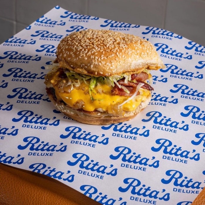
Things like food wrap with repeating logo patterns, stickers featuring the brand mascot, branded tray liners and masking tape for the to-go packages are an easy way to quickly add authenticity to what you are doing.

What made noissue a good fit for your packaging?

I love that noissue has a wide variety of packaging options available and everything is clearly shown on the website. noissue saves me a ton of time emailing back and forth about pricing by providing a range of size and quantity options as well as the cost up front. The fact that most of their products are sustainable and eco-friendly is a bonus!

All of Rita’s Deluxe’s food packaging was designed by Luke Norrad (@looknorrad)