Your About Us Isn't Really About You
Copywriting agency Sonder & Tell demystifies how to write the perfect About Us section for your website. Spoiler alert: your customer is the real hero.
By Guest Author — 04 December, 2020
“Hey, cool logo!” “Snazzy illustrations”. “That’s a super interesting interactive interface you’ve got there”.
Everyone is wowed by great design. (I run a copywriting agency called Sonder & Tell, so please imagine that sentiment being served with a side of envy). But great design does not a whole website make. First-time visitors to your site – the valuable ones who want to know more – will click on to your About Us. That’s where you get to tell your story in words.
Most people are aware of the screaming errors of an About Us page. Like typing all 2,000 words of your brand book, or spelling your own name wrong. But there are more insidious ways to derail your narrative, and therefore your brand. Like making it all about your founder’s backstory without connecting to your customers. Or just listing your product features. You wouldn't go into a party and say “these are my eyes, this my new favorite shirt, here’s my new watch”. So don’t do it with your brand.
A good About Us page is the best bits of your brand story, wrapped up for your customer. Writing it like that makes it sound easy, when really it requires a lot of thought. Try starting with the problem your customer is facing, showing how you solve it, and then setting your vision for the world. If you can do that in a tone of voice that’s full of personality then you’re laughing. And probably making people laugh at that party too.
Apart from anything else, *not* thinking about the words on your About Us page undermines the work of your design. As a very wise copywriter once said, it’s the marketing equivalent of buying a Ferrari and filling it with dishwater. Your website might look shiny and fast and expensive, but it’s not going anywhere. Here’s how to get moving.
Start with a problem

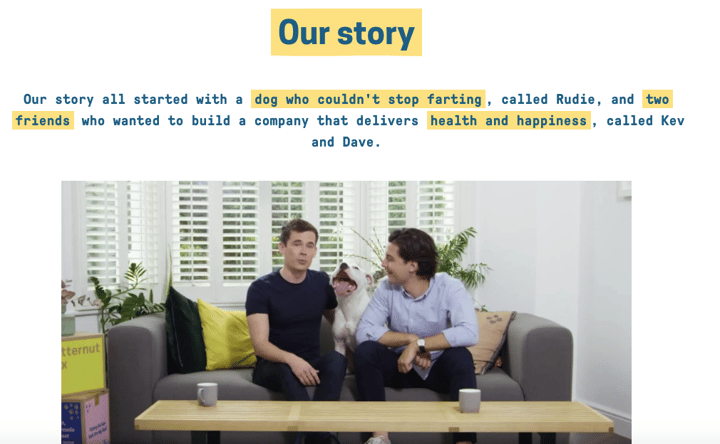
If you’ve thought about your brand positioning then you’ll know what problem you’re solving for your customers. (If you haven’t thought about your brand positioning, then go and think about it and come back.) A good way of getting right into the minds of your customers is to tap into the problem you’re helping them solve. If your brand wasn’t around, what choices would they be making? Paint a picture of what that looks like on your About Us. For D2C fresh dog food brand Butternut Box, it’s dogs with digestive issues that can’t stop farting. Gross.
Offer your solution

With a problem and solution you’ve got the bare bones of a narrative. The Great Gatsby, Angus Thongs & Full Frontal Snogging – they’re both based on a conflict just waiting to be solved. So be very clear how your brand is helping customers solve their specific issue. If it’s healthier dog food – say that; if it’s sheets that never crease – say that. This new ceramics brand Monoware was all about setting people up with tableware that lasts beyond fleeting trends: “We’ve designed a set of beautiful, everyday tools for tables which are made to endure and to grow with the people that lay them. We call it a table set for life”.
Leave the founder out, bring the customer in

You know Whitney Woolf Herd? The 31-year-old CEO of the female-led dating app Bumble that's about to file for a $6 billion IPO? She doesn’t appear on Bumble’s About Us Page. That’s because Bumble has designed their story around their customer. Making it about women making the first move – in romantic relationships, business and friendships. It’s all too easy to centre your brand story on the founder – especially when you’re small business – with statements like “I couldn’t find a shampoo I like so I made one myself”. But always try and flip that thought process and ask why the customer would care. We’re not saying don’t include your founder anywhere, we’re saying consider saving them for the team page.
Watch your tone
In a competitive market, it can be tricky to find a unique proposition, a problem that only you and your brand are solving. But you can communicate it in a unique way. By crafting a tone of voice that sounds like no one else in the market. Compare a statement like “for cuddle muffins all over the world, we big up the cosy and make sofas that really squish”, with “everyone deserves great sofas. Service too”. At the very least make sure the language you’re using is language you’d actually say in real life. Choose words like help instead of assistance, ask instead of request. Monzo’s tone of voice guidelines are good on this.
Set your vision

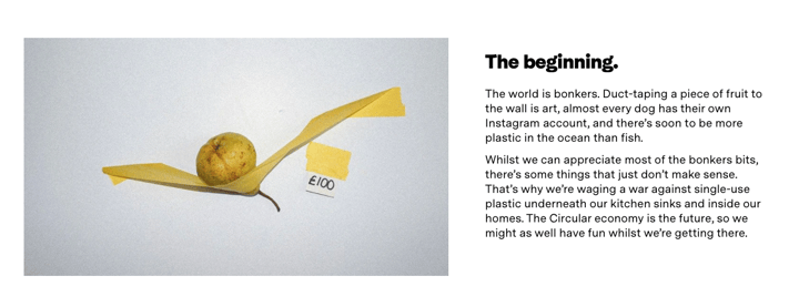
A nice way to wrap up your About Us is to nod to your brand’s vision. What world are you building and what change are you helping create? Don’t be tempted to get too lofty if it doesn’t suit your personality. We don’t all need to change the way the world eats/drinks/sleeps. A specific and simple message, like this from the circular cleaning brand, Homethings, lands well: “we’re waging a war against single-use plastic underneath our kitchen sinks and inside our homes”.
P.S: Once you’ve got your About Us page down, keep going. All of the words on your website impact how your customer perceives you (yes even those FAQs). So make sure you’re putting as much care and attention into your brand language as your design.
Kate Hamilton is the co-founder and content director at Sonder & Tell. Sonder & Tell is a London-based agency specializing in brand story, creative copywriting and tone of voice. Since launching three years ago Sonder & Tell has re-positioned and re-storied consumer-facing brands like Rude Health, Lick Home and Cath Kidston. Given Bumble UK, Bedfolk and Piccolo a new tone of voice. Helped create start-up brands like Aver and Homethings. Sonder & Tell shows that brand stories are more than a founder’s bio. That tone of voice is not a generic list of 20 words. That packaging copy can have personality. Most importantly, that your brand language can be as creative as design.