3 Ways to Make Your Brand's Designs Shine in 2022, Featuring Advice From Our Creatives
Whether you're designing branded packaging or your social media grid, great design is a must. So, we asked 3 of our creatives to share their top design tips for 2022. Here's their responses!
By noissue — 30 December, 2021
When it comes to kicking off a new year on the right foot, who better to ask than our own noissue Creatives?
We know that this past year has brought its own specific challenges and obstacles for creative businesses, but the pivots and triumphs we’ve seen have been incredible. Designers and creators everywhere are embracing change and using their unique strengths to their advantage.
Whether you’ve switched to an ecommerce model, seized the power of social media, or learned a new design skill, this year no doubt brought about incredible growth. Looking to expand our own creative horizons in the New Year, we chatted with three of our creatives to share their top design tips for 2022.
Let’s get to it!
@noissuecreatives 🔥 We're ending the year with three incredible design tips from some of our amazing noissue Creatives! Wishing you all a beautiful New Year! ✨ ##designtips ##graphicdesigntips ##designadvice ##adobephotoshop ##webdesign ##brandingdesign ##hottips ##creativesontiktok ##packagingdesign
♬ Summer day - TimTaj
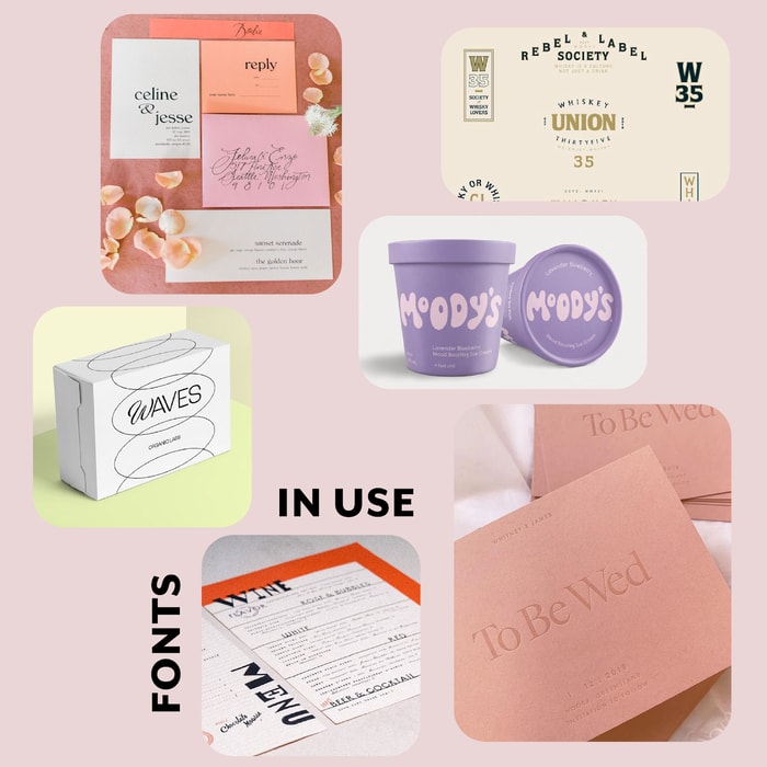
Typography Tip #1: Make Sure Those Fonts Match and Don’t Clash
Coming to you from our US-based friend Paola Buitrago is our very first design tip!
As a graphic designer, Paola strives to express her heart in each and every project. In both her client work and educational Youtube content, Paola is passionate about expanding her practice into the handmade and tactical aspects of design.
Paola believes that typography can make or break a design and gave us some recommendations for selecting the perfect font.
“The typography choices you make will impact how well thought out your design looks. Let’s say you’re doing wedding invitation design – you would want your font pairing to feel timeless and elegant as opposed to bold or funky.” - Paola
Paola shared a few examples to illustrate the power of the correct typography choice.
Here we see two simple logo options for a cheerful coffee brand, though each is very different. While the ornamental elements of the bottom font design may feel charming, overall it’s a bit jumbled and hard to read.
The top font choice is much more clear, bold and legible. It also feels modern in its simplicity and would help this brand feel relevant and current.
Switching gears to the ever popular Youtube platform, we can see two options for a bio header. Oftentimes run by individuals and much more personal or freeform, a Youtube header should reflect one’s brand and personality.
It’s easy to get a grasp of social media mogul and entrepreneur Zoe Sugg’s flair and personality with the top logo. Shaped through modern and organic calligraphy, her logo is eye-catching and feminine while still remaining simple.
The bottom logo, by contrast is oversimplified and feels a bit aggressive in its all caps, bold nature. As our eyes take in a screen, portfolio or web page, we naturally gravitate towards what is the most pleasing.
Keeping Paola’s “matching fonts” idea top of mind will ensure that your designs stand out from the crowd, in the very best light.
Be sure to check out Paola’s Instagram and Youtube channels for more incredible and informative design tips and tricks!
✨ Fun fact: Paola adores having music on while she works and can easily memorize any song or quote!
Marketing Magic Tip #2: Hone in on Your Niche to Attract Your Ideal Client
A visual designer with a heart for bringing stories to life, Esther Shim of Eastoft Studio shares our next piece of advice!
When it comes to your portfolio, it can feel tempting to showcase everything you’ve ever done – while appearing versatile is a plus, it can also water down your unique or most beloved offering. Carving out your own specific niche will help your style feel distinctive and leave no question in a potential client’s mind that your work is consistent.
This may sound easier said than done, but Esther has a few tips:
“In order to hone in on your niche, whether it be anything from sustainable businesses to life coaches, make sure to put it everywhere in your social media – include it in your Instagram posts, website bio, paid ads and even Pinterest pins. Once you do, you’ll notice that you always attract your ideal clientele.” - Esther
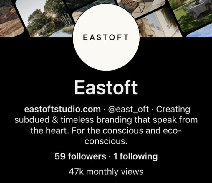
Let’s take a look at Esther’s various social channels for inspiration on how to do just that! We can see here across her Pinterest and Instagram bios that the wording is consistent and her keywords or values (conscientious and eco-conscious) appear multiple times.

Just from these two platform interactions with Esther’s brand, we get a clear and concise picture of what her design is all about, plus some buzzwords that are easy to remember – subdued, timeless, conscious, and eco-conscious.
One look at Esther’s portfolio and we can see the consistency and abundance of muted colors, clean and fresh typography choices, and earth tones across much of her work. This will undoubtedly attract the type of clients who are looking for just that. Someone wanting bold and vivid branding might not be the best fit for Eastoft Studio, and that’s fine!
By showcasing the style of work that she finds the most fulfilling, Esther is guaranteed to attract her ideal, dream clients. Putting your best foot forward doesn’t have to look like a portfolio filled with every piece of what you’ve ever created, but a curated selection of that which you most love to create.
Have a look at Eastoft Studio’s Instagram page and website for more timeless inspiration!
✨ Fun fact: Esther loves watching cheesy Christmas movies – the cheesier the better!
Printing Tip #3: Know When to Work in CMYK vs. Pantone Colors in Print for More Vibrant Vibes
At some point in your design process, you may have thought to yourself, “this color looks perfect!” While that might be the case on your screen, the world of print is a whole different story.
Graphic designer and brand strategist Lilla Loránd Peachee understands the importance of color choice and is sharing her wisdom with us!
Working with primarily natural product brands to enhance their branding and help them connect with their ideal customers has given Lilla some incredible insights on packaging design for print. To help us better understand this piece of wisdom, Lilla shared some infographics below.
Not just for screen printers and other artists, CMYK is the standard ink set used in printing systems. If you took a peek at the inside of your at-home printer, you should see the same set of inkwells.
“CMYK is best for colorful photos and multicolored graphics, while Pantone colors will ensure that you find color consistency across the digital and printed assets of the brand you’re designing.” - Lilla
If misaligned digital and print colors are the stuff of nightmares for you, don’t worry – most graphic design systems and softwares allow you to dive into the beautiful world of Pantone colors and keep what’s on your screen matching what you get back from the print shop.
Especially vital while designing for brand packaging, you want to see color consistency from a brand’s website, social media platforms down to the tissue and tape they use. What better way to create an impact than with a perfectly set color palette?
Be sure to check out Lilla’s Instagram and website for more colorful and thoughtful inspiration!
✨ Fun fact: Lilla is a track-athlete-turned-designer and mother to two rescue cats, Molar and Sampson.
Hey, 2022: Here’s to the most beautifully designed year yet!
As we dive headfirst into 2022 (whether we’re ready or not) we hope that you feel proud of all that you’ve accomplished and implemented this year. A huge thank you to Paola, Esther and Lilla for sharing these incredible nuggets of design wisdom with us!
To all of our noissue Creative Community members, thank you for all that you bring to our community and the creativity that you share so willingly. We wish you all the best and happiest New Year and will catch you in 2022!